When Colors Saved Lives: The Beautiful Maps That Tracked Death Before Anyone Knew Why
When Colors Saved Lives: The Beautiful Maps That Tracked Death Before Anyone Knew Why
Picture this: It's 1854 in New York City, and yellow fever is tearing through the neighborhoods like wildfire. Doctors have no idea what causes it — some blame "miasma" (bad air), others point to divine wrath, and a few insist it's the alignment of the planets. But one thing they can do is count the dead and paint their locations in brilliant yellows, reds, and blues across hand-drawn city maps.
These fever maps, as they came to be known, represent one of history's most beautiful accidents. Created by physicians who were completely wrong about disease transmission, they accidentally laid the groundwork for modern epidemiology and saved countless American lives in the process.
The Art of Scientific Confusion
The fever mapping craze began in earnest during the cholera outbreaks of the 1830s and 1840s. American physicians, inspired by similar efforts in London and Paris, started creating elaborate visual records of disease patterns. They used watercolors, inks, and sometimes even gold leaf to mark affected areas on detailed city maps.
Dr. Elisha Bartlett of Providence, Rhode Island, pioneered some of the most striking examples. His 1850 cholera map resembled a work of abstract art more than a medical document — swirls of deep blue marked the heaviest concentrations of cases, fading to pale yellow in areas that remained largely untouched.
The maps were based on the prevailing "miasma theory," which held that diseases spread through poisonous air rising from rotting organic matter. Doctors believed they were literally mapping bad smells and corrupt atmospheres. They had no concept of bacteria, viruses, or contaminated water supplies.
Accidentally Brilliant Pattern Recognition
Here's where it gets fascinating: Despite being built on fundamentally flawed assumptions, these maps started revealing patterns that actually mattered.
In Philadelphia's 1853 yellow fever outbreak, Dr. Wilson Jewell's color-coded map showed a curious clustering around the city's water pumps and wells. Jewell attributed this to the "noxious vapors" rising from the water, but what he was actually documenting was contaminated water sources — the real culprit behind many waterborne diseases.
Similarly, maps from Boston's 1849 cholera epidemic revealed that the disease hit hardest in overcrowded tenement districts. The mapmakers blamed this on the "concentrated miasma" of too many people breathing in one space. In reality, they were documenting the effects of poor sanitation, inadequate sewage systems, and contaminated communal water sources.
The Unintended Revolution
These beautiful, wrong maps accidentally launched a revolution in American public health policy. City officials, seeing the visual evidence laid out in vivid color, began taking action — for all the wrong reasons, but with surprisingly right results.
New York City's Board of Health, armed with fever maps from the 1850s, launched massive street-cleaning campaigns to eliminate "disease-causing vapors." They improved drainage systems, removed garbage more frequently, and regulated the placement of privies and wells. They thought they were fighting bad air; they were actually fighting contaminated water and improved sanitation.
Boston used similar maps to justify America's first comprehensive sewage system overhaul in the 1860s. The city fathers believed they were preventing miasma from rising through the streets. Instead, they were preventing actual sewage from contaminating the water supply.
When Wrong Reasoning Leads to Right Results
The fever maps reveal something profound about how knowledge advances. Sometimes the right answer emerges from completely wrong reasoning — not because the reasoning was secretly correct, but because the act of systematic observation, even based on flawed theories, can reveal patterns that transcend the observer's understanding.
These 19th-century physicians were essentially doing data visualization before anyone called it that. They were creating what we'd now recognize as heat maps, cluster analysis, and geographic information systems — all in service of theories that were scientifically nonsense.
The Legacy Hidden in Plain Sight
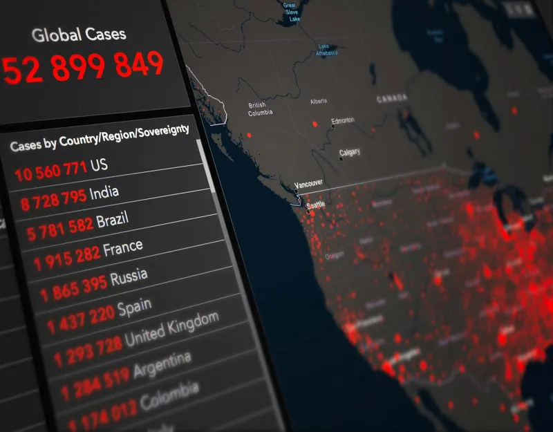
Today, epidemiologists use sophisticated computer models and satellite data to track disease outbreaks. But they're following methodologies that trace directly back to those hand-painted fever maps of the 1850s. The Centers for Disease Control's colorful outbreak maps during COVID-19 were spiritual descendants of Dr. Bartlett's watercolor cholera charts.
The fever maps also established a crucial precedent in American public health: the idea that government has a responsibility to track, visualize, and respond to disease patterns. This concept, born from beautiful maps based on wrong science, became foundational to how America approaches epidemic response.
The Beautiful Mistake That Changed Everything
The next time you see a disease outbreak map on the news — those familiar red and orange zones marking infection rates — remember that you're looking at the legacy of physicians who thought they were painting pictures of bad air. Their gorgeous, scientifically incorrect maps accidentally taught America how to fight epidemics.
Sometimes the most important discoveries come not from being right, but from being systematically wrong in ways that reveal deeper truths. The fever maps prove that even our mistakes, when documented with care and colored with beauty, can light the way toward knowledge we never knew we were seeking.